Interfaces with a point of view.
High-fidelity UI design for web products, dashboards and SaaS — built on strong typography, honest hierarchy and component logic your developers can actually ship.
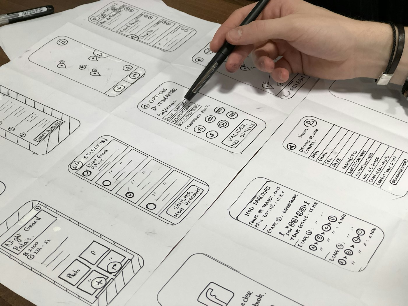
UI that goes further than a coat of paint.
Good UI design is 10% taste and 90% decisions: what gets emphasis, what gets out of the way, what happens when a field is empty, an action fails, or a name runs three lines long. We design all of it — not just the hero screen.
Every interface we deliver is built as a system: a type scale, a spacing rhythm, a colour logic and a set of components with defined states. That's what keeps the fiftieth screen as coherent as the first.
Whether your product needs a complete visual identity or a disciplined evolution of what exists, the output is the same — screens that look deliberate and build cleanly.
When your product needs better UI.
It works, but it looks generic
Template UI makes your product interchangeable with every competitor. A considered visual system makes it recognisably yours.
Every screen was designed separately
Inconsistent spacing, five button styles, drifting colours — classic design debt. We rebuild the UI as one coherent system.
Developers are guessing the details
When designs don't specify states and behaviour, engineers fill the gaps. Our specs leave nothing to interpretation.
What's included.
- Visual directionTypography, colour, imagery and interface character — explored and agreed before detailed design begins.
- High-fidelity screensPixel-accurate designs for every agreed screen, at desktop, tablet and mobile breakpoints where relevant.
- Component & state designButtons, inputs, cards, navigation and feedback — each with hover, focus, disabled, loading and error states.
- Edge-case coverageEmpty states, long content, permission errors and first-run experiences designed, not left to chance.
- Handoff-ready filesOrganised Figma files with named layers, auto-layout components and annotations developers can build from directly.
From direction to delivery.
Visual direction
We explore two to three distinct directions for type, colour and interface character, then converge on one with you — before a single screen is designed.
Key screens
The most complex and most-seen screens get designed first. Nailing the hardest case early sets the rules for everything that follows.
System & states
Components are extracted into a library and every state is designed — the moment where a screen collection becomes a real design system.
Refine & hand off
Revision rounds polish the details, then files are organised, annotated and walked through with your developers in a live handoff session.
UI design rates, published.
Landing Page Design — A$1,450
Website UI Design — A$3,900
Dashboard & SaaS Interface Design — A$4,200
E-commerce UX/UI Design — A$5,500
Common questions about UI design.
Your product deserves better than a template.
Share your product and a few example screens. We'll come back with a scope, a timeline and a fixed quote.